images are galleries
(might take some time to load)
(might take some time to load)


Workflow is a lineup of aromatic candles aimed at fighting procrastination. There are 10 mini-candles per jar, each candle having a certain burn duration, helping the user to concentrate on work while it lasts — like a timer.
The packaging incorporates minimalistic, timer-inspired features that highlight the intended usage of the product while also being functional design elements. A dial line with tick marks represents the familiar structure of a classic kitchen timer, with a triangle pointer fused with the typographic logo and pointing at the duration on the jars.
The packaging incorporates minimalistic, timer-inspired features that highlight the intended usage of the product while also being functional design elements. A dial line with tick marks represents the familiar structure of a classic kitchen timer, with a triangle pointer fused with the typographic logo and pointing at the duration on the jars.
Workflow is a lineup of aromatic candles aimed at fighting procrastination. There are 10 mini-candles per jar, each candle having a certain burn duration, helping the user to concentrate on work while it lasts — like a timer.
Workflow is a lineup of aromatic candles aimed at fighting procrastination. There are 10 mini-candles per jar, each candle having a certain burn duration, helping the user to concentrate on work while it lasts — like a timer. The packaging incorporates minimalistic, timer-inspired features that highlight the intended usage of the product while also being functional design elements.
The packaging incorporates minimalistic, timer-inspired features that highlight the intended usage of the product while also being functional design elements. A dial line with tick marks represents the familiar structure of a classic kitchen timer, with a triangle pointer fused with the typographic logo and pointing at the duration on the jars.
pentawards 2025 — gold
dieline awards 2025 — best of show
dafes 2025 — gold
sreda 2024 — silver open jury
sreda 2024 — short list
dieline awards 2025 — best of show
dafes 2025 — gold
sreda 2024 — silver open jury
sreda 2024 — short list


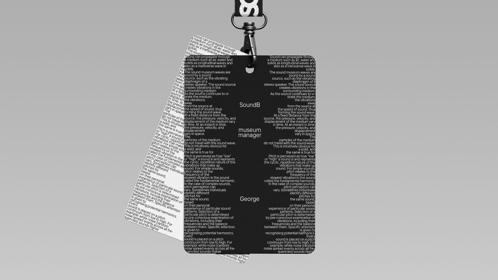

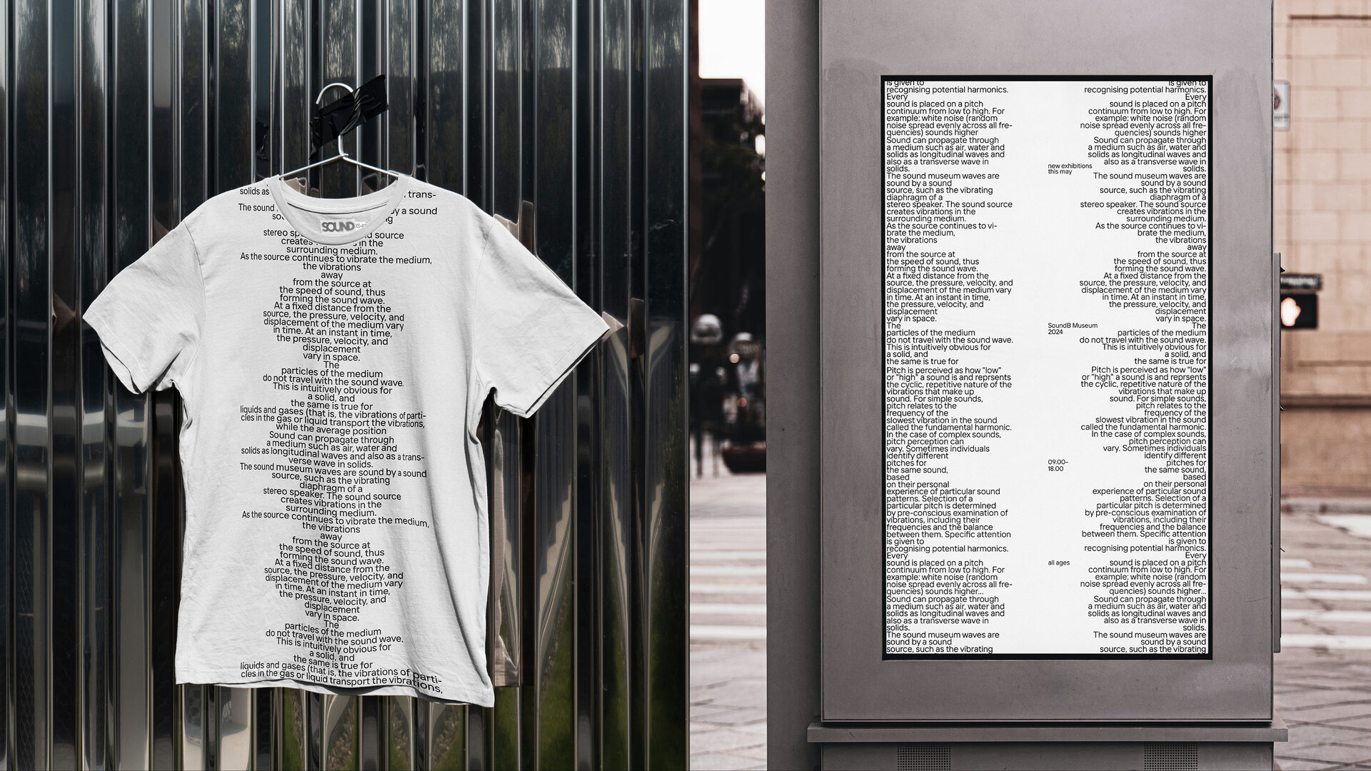
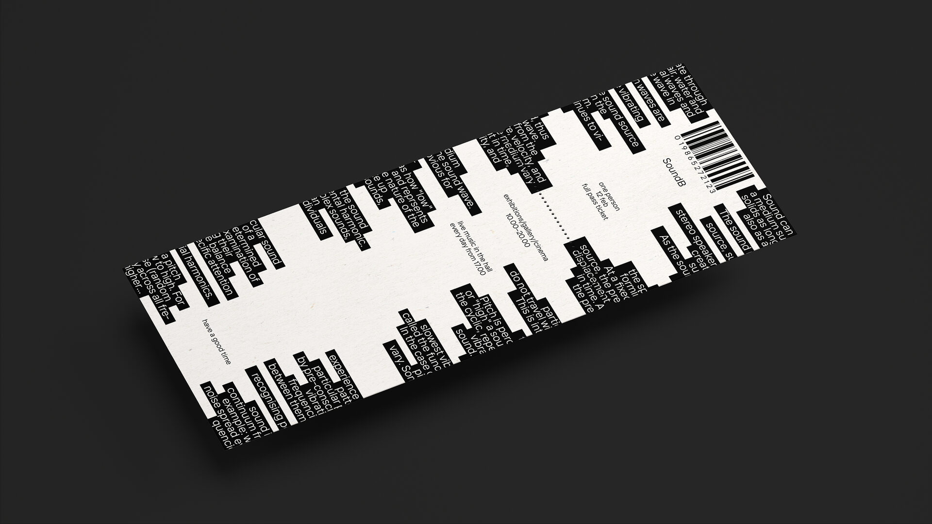


A concept of a typography-centered brand identity, merging the ideas of knowledge and information as key resources of a museum with the uniqueness of each sound’s appearance. The wave shapes are variable and easy to scale.

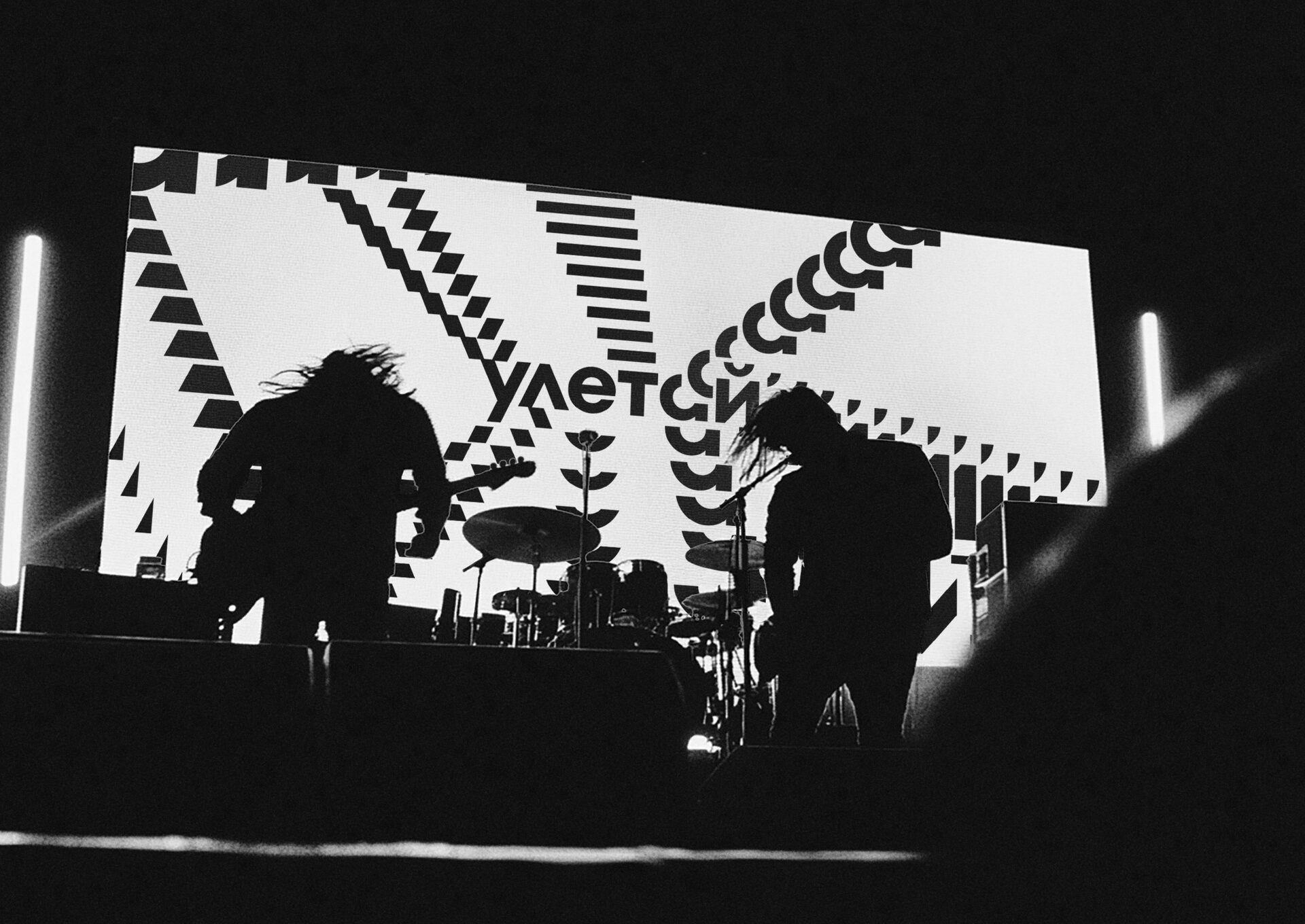


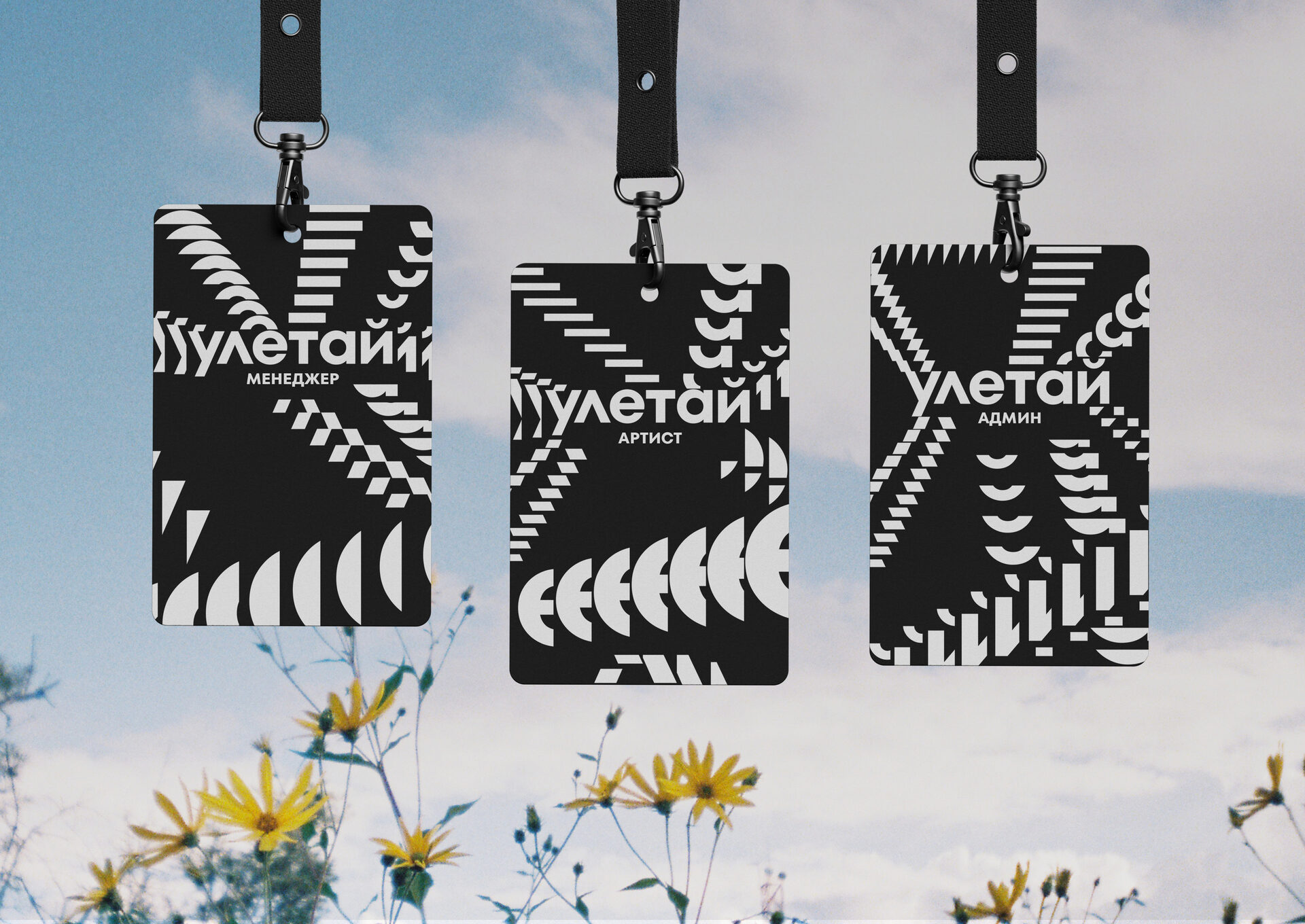
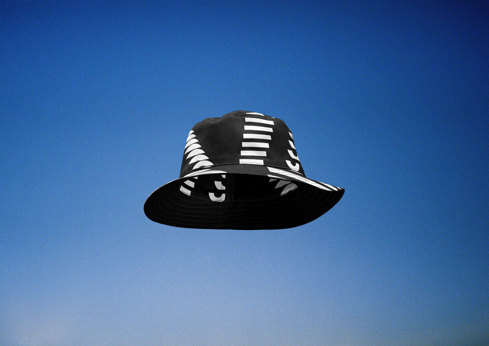

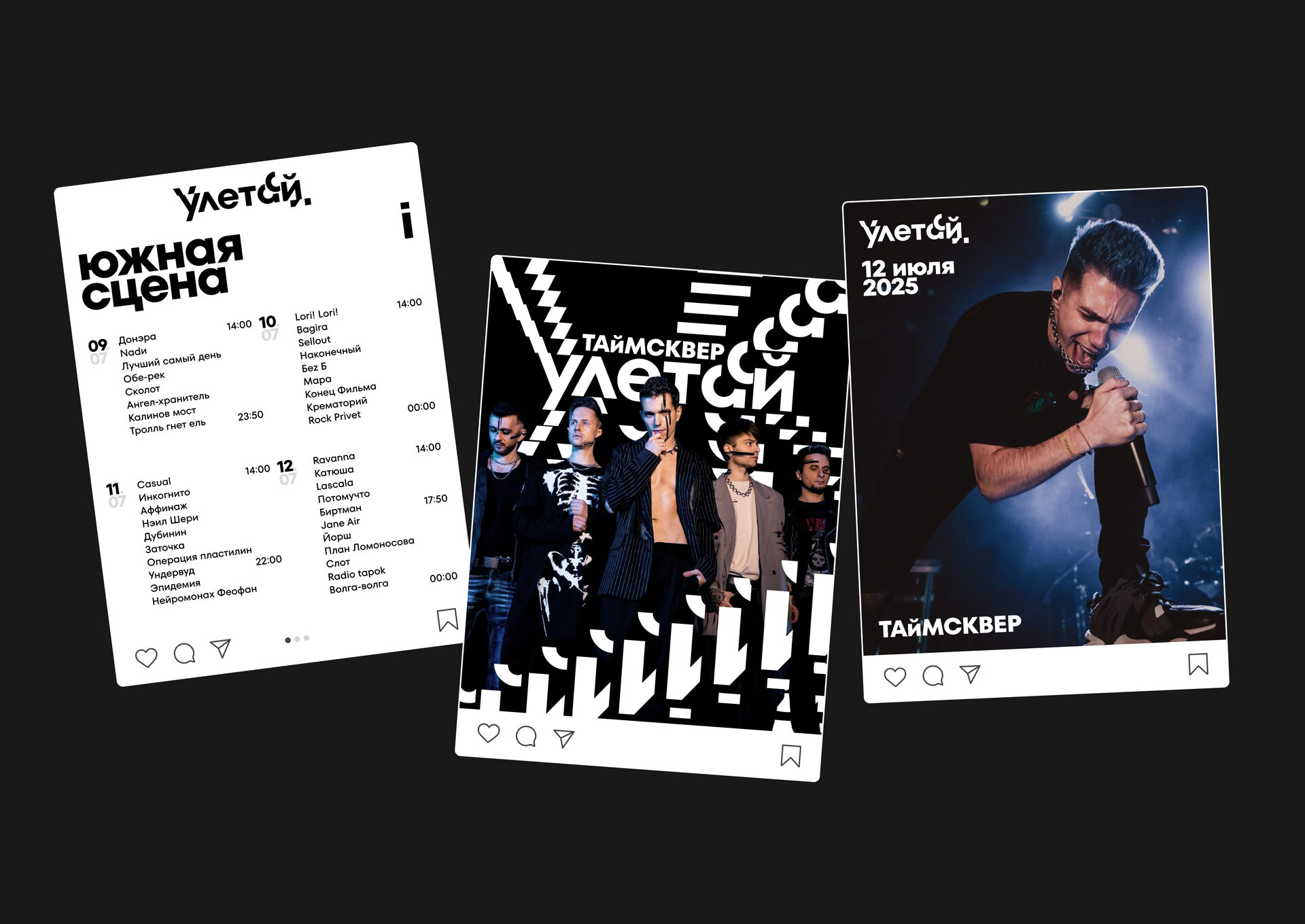


«Uletai» is a large open-air rock and alternative festival. The rebranding concept is based on the metaphors of high volume and scattering echoes, the feeling of music under the night sky. It emphasizes the main goal of the festival visitors: to relax without any limits and be as loud as they want.


A full product lineup packaging for Baum Zindech — a manufacturer of household appliances and smart beauty devices. The task was to refresh the color scheme and create a clean layout logic on the boxes, while keeping the logo and the recognizable line.


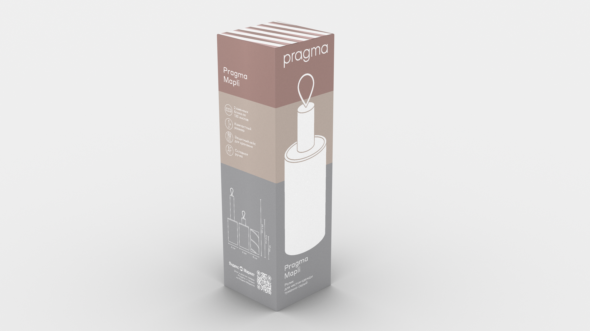


Packaging design developed for a sub-brand of Yandex. Based on the existing visual guidelines but adding product-related color coding with clean typographic elements. Features a custom illustration of the product in the brand’s style.


This design of the WildBloom mineral water can allows you to take a piece of the water’s source with you through the photos taken near its place of origin. The predominant minerals for a particular source are displayed on the front side, and more details with a map of the location can be found on the back of the can.


Branding project for a honey festival. The visuals are based on a metaphor of bees gathering over honey. The packaging helps to differentiate between honey types: the more crowded it is on the jar — the thicker the honey.


